Thursday 13 December 2012
Context 3 Images V.2
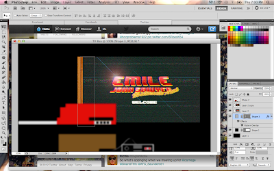
Here are the images , my purpose was to really emphasise the feeling of viewing these images through old television set. these images will be placed in a custom television box that i am in the process of creating in a similar vein to my old images.
Wednesday 12 December 2012
Xmas Holidays - I Wish
So the xmas holidays are here , a time of rest and sleep. Not in my case , apart from working in retail which is the worse at xmas , i had taken upon my myself to develop my context 3 images over the xmas holidays , so far i have done two out of five, and portray the 8it gaming theme better than the ones perviously posted.
I will be posting the two images later tonight.
I will be posting the two images later tonight.
Friday 7 December 2012
Wednesday 5 December 2012
Research Project
An interesting diagram which shows the rise of mobile technology and communication in the workplace which is what i am discussing in my research project
Tuesday 4 December 2012
Client Project 98% -Done.
i have pretty much finished my client for this term and i am pleased with the way it has turned out , although i decided to change the layout of the website halfway into this process, but i believe it does meet my own personal brief of having a clean simple website. below are zoomed out screenshots of the website , and don't take notice of the coloured boxes ,as i am in the process of creating logo's and finding good quality pictures for the staff pages.
Below are the four main pages of the website , with four more pages within the staff page , the home page kind of resembles back to the old wire frame i did back last month of having two main containers side by side with each other , but instead of having a mission statement , i decided to have the navigation there. I believe this create an instant calmness , putting the user at ease , rather an bombarding them information on the page.
I have learned from the mistakes of the last solo project i did , and stupidly not having the HTML page in HTML 5 , ALL the pages are up the HTML 5 and CSS3 Standard. i will be validating the pages on Thursday evening
i will adding finishing touches here and there to really make the website good ,but the bulk of it has been finished.
Below are the four main pages of the website , with four more pages within the staff page , the home page kind of resembles back to the old wire frame i did back last month of having two main containers side by side with each other , but instead of having a mission statement , i decided to have the navigation there. I believe this create an instant calmness , putting the user at ease , rather an bombarding them information on the page.
I have learned from the mistakes of the last solo project i did , and stupidly not having the HTML page in HTML 5 , ALL the pages are up the HTML 5 and CSS3 Standard. i will be validating the pages on Thursday evening
below are the responsive pages , i have used media queries in order to make it responsive and i have only made it responsive for the Ipad only and not any smartphone devices , the reasoning behind this is because the type of people viewing this website will not be casually browsing via a mobile device such as the iPhone or android , which most people do from a smartphone device
Sunday 2 December 2012
Coding development - Staff Pages
just finishing off the staff pages , little minor annoyance as i couldn't get the H1 tags to respond to the margin movement so i have had to put the staff names in the P Tags
Friday 30 November 2012
Code Development -ATRG
Now that context 3 is finally out of the way , i can fully steam ahead with client and research , its been a long day but i have made progress on the site , i have pretty much finished with the home and about page , and just finished off one of the many staff pages i shall be doing. the contact page will be in the bottom of the footer
Context 3 Submitted
Just submitted context 3 and it has one of the most confusing briefs i have ever encountered am just hoping that i didn't make a massive mistake and get marked down massively
Catalogue Text.
Emile John Sawyer, Multimedia artist;
that would best describe his abilities bringing together the different mediums
of Web and Graphic Design with Photography
, blending these methods in imaginative and rousing ways. Whether it is front
end development or Graphic Design Marketing. Multimedia solutions for a
multimedia world.
Wednesday 28 November 2012
New Portfolio Website -
Just in case , you haven't seen the theme for my website , there it is , still a LONG way from being ready , hoping ready to launch in the new year.
The reason why i am showing this i, is because i wanted to demonstrate the flow and cohesion between my website , my context 3 images and my business cards (when they get made) so when the final exhibition comes along , the will be a grand design.
The reason why i am showing this i, is because i wanted to demonstrate the flow and cohesion between my website , my context 3 images and my business cards (when they get made) so when the final exhibition comes along , the will be a grand design.
Tuesday 27 November 2012
Context 3 Images - 8BIT Wonder
Below are some of my context three images , as you can see , i have gone with a 8it classic NES style to portray my abilities and skills , the reason why have chosen this type of design , is apart from being a devoted gamer , the design fits in with the design of my new website which should be launching in the new year. Enjoy.
i still haven't finished two of the images , and the responsive design image still needs work , you get the idea that am going for, vintage gaming and vintage look.
Tuesday 20 November 2012
Development - ATRG
Haven't posted in awhile , but have been hard at work , doing this website , i have made major progress on the home and some on the about page , below is a screenshot of the home page in its current state
And here it is the slider with a few tester images , here i am just testing whether the transparent images work on the slider which they do.
And here it is the slider with a few tester images , here i am just testing whether the transparent images work on the slider which they do.
Sunday 11 November 2012
Coding Development - ATRG
Again
I have changed around the layout of the design , I think I am finally happy
with this design to be honest for the home page.
Friday 9 November 2012
Coding Development - ATRG
As you can see , I have decided to
change the layout of the website , the reason being I wanted to feel more of
the empty space surrounding the main body wrappe
r.
Just a quick update ,on the
background , here I am using , CSS3 to make the background responsive since am
using an image as a background
Thursday 8 November 2012
Coding Development - ATRG
So I began coding today , basing my wire-frame on the designs that I did previously but as I began coding the
website there was something wrong with the feel of the site, it seemed empty ,
maybe this feeling will pass on, but at the moment I can’t shake the feeling
that there is too much negative space.
Wednesday 7 November 2012
Wireframe Development - ATRG
I have also been
developing the wireframes of the site , to see which one is best
suited for this client project , I think the key to this is brief is
to keep it simple , the type of user that will access the site ,
will not want to play around with an over developed interface.
i have tired to implement my logo designs to the prototypes aswell.
Logo Development - ATRG
Over the past two days I have been really cracking on the development of the project , in this case I have been creating different logos for the ATRG , as I said in my presentation , I believe that when you think of ATRG , and the work they undertake , you cannot help think of the future and that is what I have tried to implement in my designs.
Design 1
To solve this problem I could move the letters closer together and make the lettering after the “ATRG” much bigger but I like the amount of spacing in-between the letters and I feel if I move the lettering closer together then , it would seem cluttered and not achieve the clean logo I want to achieve.
Design 2
I wanted to experiment with my second design , so this design is more of a high concept idea then the pervious , I have gone for a more unusual layout aswell, by having the lettering at an angle, also on reflection , I wanted to implement the science factor more into my design , so I created guidelines at either side of the logo.
Design 3
This design is more hasn't got much changes from design 1 , just slight changes such the brightness of the logo , which I had added an outer and inner glow , and I have also blurred out the guidelines at the sides of the logo to give a more 3d Effect on the logo.
Design 4
Again I wanted to develop the science aspect much more then in design 3 , so I decided to add “wiring” to my logo design , and I like the effect that it brings to the image , but again I feel that it is too cartoonish and not the clean cooperate image I wanted.
.
Design 5
Again , just more development on the design , this time I added a patchwork effect in an attempt to play to the “textiles” aspect of the group.
Design 6
This is more of the style of logo I am trying to achieve, I believe it strikes a perfect balance between high concept design and corporate importance, I wanted to keep the design simple and the typeface clean , the line I have running through the middle of the logo plays a vital role in the design linking the A,R and the G.
Subscribe to:
Posts (Atom)


