Tuesday, 19 April 2011


Were are into week three of animation and I can safely say that animation is not for me , I just do not get one bit , give me DIV tags and single column website layouts any day of the week , so far into it I hear you ask , not very much , I have design the building and the track (need apply  a sweep modifier for the third time after the first track I designed had disappeared and the second track file was corrupted)  and I am begging to design my cart but I again my struggling to do that as the instructions on the website are not very clear , and I think video walkthroughs instead of screenshot would be 10x more helpful. I think I need to contact Andy on this one.  I am not happy. 


Monday, 11 April 2011


So we are on to our last project for the year , which is 3D Animation and to be honest i have heard nothing but dread from my fellow students concerning this project , As task is as follows: Design, build and animate an amusement park, terror, haunted castle/house ride to fit into the Waverley Theatre with 2-3 scare scenes. It seems simple enough, but there is a lot of work required to get the maximum output from this task.

In the first week, we have learn the basics of building the rollercoaster track, the angles and logistics of the Waverley building , to my surprise I managed to quickly pick the skills needed for this and wasn’t too confused by the end of the session . i have already decided on a theme for my ride , it will be ancient Egypt , thje kind of look i am going for can be best explained in the video below.


Wednesday, 30 March 2011


EVALUATION 


I wanted the most from this project is to project the type of design ideas that best reflect me as graphic designer, web designer but mostly me as a person; I wanted to use this opportunity to project my best aspects of my skill. I wanted my portfolio to be something unique and not dull and uniform like most of the other online portfolio’s out there. I used a range of  research methods on this project , as it the one I wanted to take up for the next two years , I wanted to get as much information as possible , firstly I decided to use a mood board , this enabled me to get my ideas from my head into something more substantial. Second I did primary visual research again , the design idea I wanted to portray in my online portfolio is similar to a well-known gastro-pub near the Newton building , so I went there and took a few photos as a key reference in my designs. I also looked a few YouTube video’s for inspiration, the theme I was looking for is the “hand-drawn” 70’s-80’s retro vibe, so I looked at the music band “Two Door Cinema Club” and their video “I Can Talk” which has a very retro vibe and I tried to use that vibe into my designs.


Trying something new...or at least trying

This where I felt I fall short  , even though I wanted to make something new and exciting for the viewer and also me to look , i wasn’t able to manage it in my own opinion and I believe it was down to two things ; one my lack of experience with Dreamweaver and Flash – Some of design ideas , I wanted to do in the first place , I just didn’t have the necessary experience to implement it into my design , others have more experience in Dreamweaver and some Flash and were able to make some impressive designs , and it was the first time were I felt a little out of my depth. Second was time – it dawned on my just 
how much detail is needed my creating a good website let alone an excellent one , each element requires something , such as the placement of the navigation bar in accordance with human eye , if I had more time , I would have liked to experiment with different ideas and design layouts , but due to the short time I had to work with plus my lack of experience in Dreamweaver , the design , although it looks good is quite simple in its design layout.
The most I have learnt from this particular project is the amount of detail required in order to make a successful website, every from the where the navigation bar will be placed , what type of typeface will the main content comprise of , will the website require some sort of Flash plug-in , or HMTL5 , so the main thing i have learned from this , is detail is everything in Web. Another thing which has hit , is that I feel that my future does lay in Web but more towards the designing aspect rather than the actual building.

Sunday, 13 March 2011


Been awhile since i updated this thing , so my apologies, it’s just that I have trying to solve this problem that this HTML Coding on my website , I am pretty much done with that thing , it has the same design as before and I am happy with it  , the only thing left to do is do that image gallery which am going to ask Giselle to help me with , but the MAIN problem , the problem which is giving me the most stress is simply  changing the background image on two of my pages, every  time I try to change it , something goes wrong such as all my others pages change to that background image. Giselle managed to do it for my about page and I have followed her techniques no luck, is the only thing which stopping me move forward with the project. other than that I have enjoyed the project , i look forward to taking it next year , if i can get a hang on the basics of DIV TAGS , HMTL , CSS , ID’S And CLASSES then I could excel at it 


Wednesday, 2 March 2011


Today was a very successful day in terms of my understanding of DIV tags , HTML and CSS. After last week’s Sem , I must admit I was struggling with the coding , as  thought i would be , but after talking with Giselle , explained to me that once you get your head about the different type of DIV tags (a total of 5) and the CSS it is really quite simple. Another reason why today was successful for me is because have finally come up with a design with incorporates both the “hand made “feel” with that 70’s retro vibe.
My design
The Home Page
About Page
Above are two examples of the background images I created for my online portfolio, as you can I have left out the text because i will be adding that at a later date  , also with link buttons also. 

Sunday, 20 February 2011


This is the second re-design from the first design I did and already I like it better, it shows off a little more skill then before, and lots more personality, in this version I have tried to make the website seem more “hand-made” that why i have decided to include the hand drawn pictures and the typeface which is Akbar, again gives it the made from hand feel, but this early design is not without its flaws. I think the main section of the screen is rather too busy with the cartoon drawings, ad the is a lot of negative space behind the text (the white background) something which I will have to fix up in the re-designs.  

When i tweaked with the levels abit ,alomst  giving it a 1970's feel
At the moment am at a crossroads, I want that handmade feeling , but i am getting more and more impressed and inspired by the that “1970’s” feel  , I think the best way to descried the kind of style i am going for is design of Spanky Van Dyke’s.

– a bar/bistro that is opposite the Newton building at Nottingham Trent university   , it has that organic feel , but combined with a real 70’s American  retro feeling  something right out of Saturday Night Fever., it is one of my favourites bars in Notts  and I recommend anyone to pop in and take a look. Another inspiration i have had is the two music videos from “I can talk” by “Two Door Cinema Club” and “Hello” by Martin Solveig & Dragonette both of which give me the feeling of 70’s Europe. 


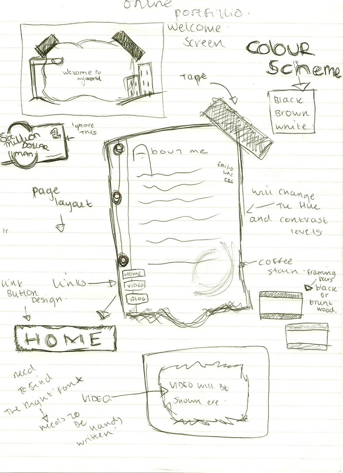
Here I have started to plan what my website will look like, and already I am feeling that creative and perfectionist inch, this is my first design and I fully expect to change my mind about 705050 times before I finally reach my final design choice, bad way to go about stuff I know, but it is the only way I know. 


This first design is rather simple in my mind; it has a background image which a Gaussian blur will be applied to.   , a navigation bar towards the left hand side, which contains the following links (About, Portfolio, Video, Blog, Contact) a mini about page on the upper left hand side of the blurred background image) my full named will be on the lower  right hand side of the blurred background image  , and a footer containing all the necessary information (copyright etc)/ when I first thought of this  design in my head  I thought it was a good solid design , it had simple lines and a easy to use interface. Then it hit that this design is the same as every other website out there. There was nothing which says personality.  

We have started interactive spaces today and this is where I believe my future career lies , it combines graphic design (which i love) with wed design (which I am interested in) okay the coding  might be an issues , and is bound to give me sleepless night I bring it on I say. So toady lecture was very interesting, and I was surprised to learn that they are over 1 trillion web pages currently online,  so one of the key things I took from the lecture was to  make your website unique , the average user only spends 2.5 seconds on a web page , so not long to make an impression.


To help ease into this project we have been told to create a mood board , something which best describes our interests , personalities and feelings , i found it useful and a stepping board to best show off my style.  

Wednesday, 16 February 2011


Pre Production.

At the start of the Moving Image module we were told that we were to be given scripts that were written by Jools, We were handed a script entitled “Herds” (what this title has to do with the actual film i will never know). Herds is the tale of a Character named Monty who invites himself into the houses of unfortunate flat dwellers , investigates their cupboards and fridges , eats their food , before either leaving or most times being thrown out. He dusts himself off being moving on. At the start of the production each of us were given a role (Director , Editor , Sound , Camera , Lighting etc) I was given the of role of Sound , and at the start I was quite pleased with it , as I always had an interest in sound design. The Pre production phrase went very well in my opinion, Dan (Producer) kept everything in order, filled out all the necessary sheets and forms and generally I found his role , especially in this pre production stage to be very good indeed, the Other members all seemed to know what they were doing ,which is a nice change from last year.

Production.

Unfortunately this is the stage where we had the most problems , mostly whilst principal photography took place , to start with the two actors will for lack of a better word “hired” didn’t show up , when contacted both of them said they have both forgot a 3hours lecture that they have the same day but were available later at 3pm. A poor excuse, so it was up to the editor and producer to take up the roles which to be fair to them did a fantastic job , so it worked out quite well, one other thing which pleased the was quality of the location which was silent ,(which is good for me in the sound department so every little sound was picked up by the camera) and had enough space in order to place lighting rigs ; lighting in general was fairly good , but sometimes it was uneven so it gave the film uneven and harsh shadows , we filmed using two cameras , allow easier editing and looked very professional , complete with over the shoulder shots for both actors , again at this stage I was quite pleased with production.


Post Production


It was it this stage were i realized that my pathway didn’t lay with moving image , it’s not of team , which were great , it’s just that i feel i didn’t have my creative inputted onto the film and I didn’t feel i was contributing much to the cause , all though I did fulfilled my sound duties , I just wanted to have my say over every little creative decision, such as the hue of the film , the titles , the typecast etc , and that’s where i realized that my love for graphic and web design and everything that comes with it , although I believe the film came out very well , any problems that occurred during the production , was swiftly dealt with , we believe that the film portrays Jools script perfectly and on a personal idea , am glad my idea of having the booming/muffled soundtrack came out every well on film.

Pre Production.

At the start of the Moving Image module we were told that we were to be given scripts that were written by Jools, We were handed a script entitled “Herds” (what this title has to do with the actual film i will never know). Herds is the tale of a Character named Monty who invites himself into the houses of unfortunate flat dwellers , investigates their cupboards and fridges , eats their food , before either leaving or most times being thrown out. He dusts himself off being moving on. At the start of the production each of us were given a role (Director , Editor , Sound , Camera , Lighting etc) I was given the of role of Sound , and at the start I was quite pleased with it , as I always had an interest in sound design. The Pre production phrase went very well in my opinion, Dan (Producer) kept everything in order, filled out all the necessary sheets and forms and generally I found his role , especially in this pre production stage to be very good indeed, the Other members all seemed to know what they were doing ,which is a nice change from last year.


Production.

Unfortunately this is the stage where we had the most problems , mostly whilst principal photography took place , to start with the two actors will for lack of a better word “hired” didn’t show up , when contacted both of them said they have both forgot a 3hours lecture that they have the same day but were available later at 3pm. A poor excuse, so it was up to the editor and producer to take up the roles which to be fair to them did a fantastic job , so it worked out quite well, one other thing which pleased the was quality of the location which was silent ,(which is good for me in the sound department so every little sound was picked up by the camera) and had enough space in order to place lighting rigs ; lighting in general was fairly good , but sometimes it was uneven so it gave the film uneven and harsh shadows , we filmed using two cameras , allow easier editing and looked very professional , complete with over the shoulder shots for both actors , again at this stage I was quite pleased with production.

on

Friday, 11 February 2011


So after a long day trying to get a muffle effect in Soundbooth , It came to me that Sony Vegas had to desired effect i wanted to get - Come home and try to Download it only to find i can't.
Brillant. Below you can find some Production Shots of Project Intruder filming on the day.


Trying to edit a sound file for the film , all am trying to do is muffle the sound so that it seems that its coming from somewhere , but trying to Soundbooth CS5 is a nightmare , it just seems overly complicated , i saw a video on Youtube which has the ffect i want but that was using Sony Vegas m which looks like i will have to download that Tonight. Nightmare